Delight Your Audience with Smarter Website Design [Infographic]
Is your website bringing in business or turning it away?
Launching a website isn’t the end of the marketing process, it’s the beginning. To hone your message, we put together an insightful fact sheet for you to use and share. These 17 statistics help make the case for smarter website design that results in a better user experience. Start delighting your audience with a message that’s most effective for them.

In Today’s Market – The Medium is the Message
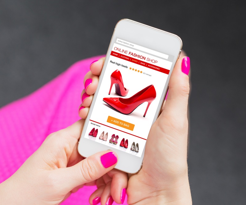
With more and more people using smartphones, tablets and other devices to view websites, having optimized page design is key. Today’s consumer wants to explore sites that are visually pleasing and clearly organized. Your homepage needs to invite users in and effortlessly provide them with the information they’re looking for.
Clear Company Info Succeeds
A successful webpage engages potential clients, highlights your product or service and introduces them to your company. Who you are and what you do must be clearly defined. Fifty-one percent of people think “thorough contact information” is the most important element missing from most company websites. If they can’t reach you, sales are lost.
Is Your Website Reaching the Masses?
The world’s best designed website means nothing if the homepage isn’t accessible. If visitors experience trouble downloading media or if it takes too long to launch, 39% will leave. Period. Today’s users are not willing to be patient. Don’t make them search for product information or wait for complicated graphics to render.
About Us a Popular Destination
Consumers come to your website looking for products or services and from there want to know more about your company. Although the “About Us” page is an afterthought for many, it is actually where many businesses miss an opportunity to pitch themselves to would-be customers. Brand loyalty is about connecting with people and your company can do that with a well-written, informative About Us page. Remember – the smallest details do matter.

Design Your Website for Your Users
- Keep it simple and well organized
- Create it with mobile devices in mind
- Provide clear production information and reviews
- Let them know where to reach you
- Connect with your customer, you want them to return
Get Your Website Back on Target
You are proud of your business and your website should reflect this. Remember, too – that 86% of visitors are looking for information on products and services when they come to your site, and then they want to know what kind of company you are. Make sure your message isn’t getting lost in design clutter. Focusing your efforts on the right medium, the clearest information and user-friendly design elements will soon get your website back on target.
GET TO KNOW EVEREFFECT
With over 18 years of Internet experience with Fortune 500 companies, Chris Bross knows about directing and implementing online experiences. As Partner and Chief Operating Officer, he brings a wealth of knowledge in all facets of online marketing and cross channel strategies to EverEffect, giving him special insight into Customer Online Self-Service, Search Engine Optimization (SEO), Search Engine Marketing (SEM), E-commerce, Online Customer Acquisition, Conversion Tactics, Developing Internet Strategies, Online ROI Measurement and more. If you’re curious about what he’s thinking, give him a call at 888-506-2183 and pick his brain on how to improve your online presence. Or ask for a face-to-face.


1 comment on “Delight Your Audience with Smarter Website Design [Infographic]”
Hello Chris,
Well written and cool infographic.
Thanks for sharing.